
SANGO CUSTOMIZE GUIDE
SANGOカスタマイズまとめ
ぶるーとカフェで使っているデザインと設定を紹介。
ぶるーとカフェでは、WordPressテーマ「SANGO」を使ってブログを運営しています。
このページでは、実際に取り入れているデザインやカスタマイズを、完成イメージとともに紹介しています。
気になるデザインがあれば、設定方法もチェックしてみてください。カスタマイズの内容は、少しずつ追加していく予定です。
カスタマイズを探す
サイト全体・ナビゲーション

パンくずリスト
ページの現在位置が分かりやすいように、パンくずリストのデザインを調整しています。
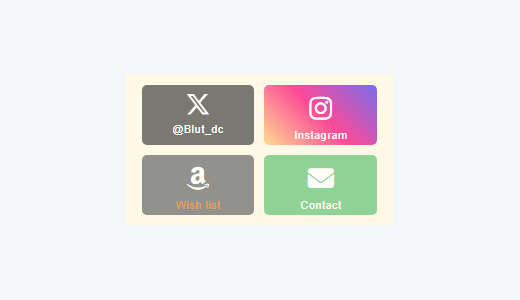
プロフィールSNSボタン
プロフィール内のSNSや外部リンクを、2列×2段のボタンにまとめています。

トップに戻るボタン
画面右下に表示されるボタンの背景色と矢印色を、サイトに合わせて調整しています。

① パンくずリスト
いくつかのサイトで紹介されているカスタマイズ方法を参考に、文字サイズや文字間隔、色、スマートフォンでの表示などを調整しています。
設定場所: WordPressの追加CSS
CSSを見る
#breadcrumb {
  font-size: 16px;
  letter-spacing: .2em;
}

#breadcrumb li a,
#breadcrumb li:after {
  color: #999;
}

#breadcrumb li:after {
  opacity: .54;
}

#breadcrumb li:last-child:after {
  display: none;
}

@media only screen and (max-width: 480px) {
  #breadcrumb {
    text-align: center;
  }
}
② プロフィールSNSボタン
for menさんのカスタマイズを参考に、プロフィール欄のSNSボタンをアレンジしました。 TwitterのアイコンをXに変更し、ボタンのサイズや色味を調整。4種類のリンクを2列×2段に配置しています。
設定場所: プロフィール欄のHTML・WordPressの追加CSS
プロフィール欄にHTMLを設置し、WordPressの「追加CSS」にCSSコードを追加してください。 HTML内のリンク先URLやアカウント名は、ご自身のものに変更してください。
HTMLを見る
<div class="prof-sns">

  <!-- X(旧Twitter) -->
  <a class="pf-btn x-bc"
     href="https://x.com/Blut_dc"
     target="_blank"
     rel="noopener noreferrer"
     aria-label="X @Blut_dc">
    <svg xmlns="http://www.w3.org/2000/svg"
         viewBox="0 0 24 24"
         width="24"
         height="24"
         fill="currentColor"
         aria-hidden="true"
         style="display:block; margin:0 auto 4px;">
      <path d="M18.901 1.153h3.68l-8.04 9.19L24 22.846h-7.406l-5.8-7.584-6.638 7.584H.474l8.6-9.829L0 1.154h7.594l5.243 6.932 6.064-6.933Zm-1.29 19.49h2.039L6.486 3.24H4.298L17.61 20.644Z"></path>
    </svg>
    <div>@Blut_dc</div>
  </a>

  <!-- Instagram -->
  <a class="pf-btn instagram-bc"
     href="https://www.instagram.com/pieris_blut/"
     target="_blank"
     rel="noopener noreferrer">
    <i class="fab fa-instagram" aria-hidden="true"></i>
    <div>Instagram</div>
  </a>

  <!-- Amazon Wish list -->
  <a class="pf-btn amazon-bc"
     href="https://www.amazon.jp/hz/wishlist/ls/2I1LN655YT5F1?ref_=wl_share"
     target="_blank"
     rel="noopener noreferrer">
    <i class="fab fa-amazon" aria-hidden="true"></i>
    <div><span style="color:#e47911;">Wish list</span></div>
  </a>

  <!-- Contact -->
  <a class="pf-btn email-bc"
     href="https://blut-cafe.com/contact/"
     target="_blank"
     rel="noopener noreferrer">
    <i class="fa-solid fa-envelope" aria-hidden="true"></i>
    <div>Contact</div>
  </a>

</div>
CSSを見る
/* ====================================
   プロフィール|SNSリンクボタン
==================================== */

/* SNSボタン全体 */
.prof-sns {
  text-align: center;
  padding-top: 5%;
  border-top: 2px dotted #eee;
  font-size: 0.6em;
}

/* SNSアイコン */
.prof-sns i {
  font-size: 3em;
  line-height: 34px;
  margin-top: 6px;
}

/* XのSVGアイコン */
.prof-sns .x-bc svg {
  display: block;
  width: 26px;
  height: 26px;
  margin: 6px auto 4px;
  fill: currentColor;
}

/* ボタン共通 */
.prof-sns .pf-btn {
  display: inline-block;
  width: 43%;
  height: 60px;
  margin: 0% 1.5% 5%;
  border-radius: 5px;
  letter-spacing: .05em;
  opacity: .7;
  color: #fff;
  text-align: center;
  text-decoration: none;
}

/* ホバー時 */
.prof-sns .pf-btn:hover {
  opacity: 1;
  text-decoration: none;
  transition: all ease-in-out .3s;
}

/* ボタンの背景色 */

/* X */
.prof-sns .x-bc {
  background-color: #424242;
}

/* Instagram */
.prof-sns .instagram-bc {
  background: repeating-linear-gradient(
    45deg,
    #FED06E,
    #FC0077,
    #3F35EE
  );
}

/* Amazon Wish list */
.prof-sns .amazon-bc {
  background-color: #232F3E;
}

/* Contact */
.prof-sns .email-bc {
  background-color: #2BB24C;
}
参考記事: for men|SNSボタンを横長2列にしてみた
③ トップに戻るボタン
SANGO標準の「トップに戻るボタン」の背景色と矢印の色を変更しました。 ボタンの形や機能はそのままに、サイト全体のデザインになじむように配色を調整しています。
設定場所: WordPressの追加CSS
CSSを見る
/* トップに戻るボタン */
a.totop,
a.totop:hover,
a.totop:focus {
  background-color: #カラーコード !important;
}

/* 矢印の色 */
a.totop i.fa-chevron-up {
  color: #カラーコード;
}
④ スマホメニューのホームボタン
for menさんの記事を参考に、スマートフォンのメニュー内に「ホームへ戻る」ボタンを追加しました。 カスタムHTMLをウィジェットに設置し、追加CSSでボタンの大きさや配置、デザインを設定しています。
設定場所: 外観 → ウィジェット(スマホ用ナビドロワー)/追加CSS
HTML・CSSの詳しい設定方法は、参考記事をご覧ください。 設置する際は、ホームボタンのリンク先を自分のサイトURLに変更してください。
見出し・記事内装飾

中央寄せの見出し
固定ページで使用している、 中央寄せと短いラインを組み合わせた見出しです。

アイコン+横線の見出し
アイコンと横線を組み合わせて、 各カテゴリーの区切りを分かりやすくしています。
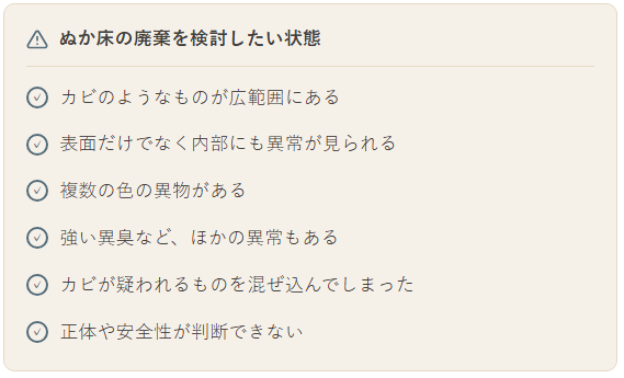
タイトル付きチェックリスト
タイトルとチェック項目を1つのボックスにまとめ、 情報を整理して見やすくしています。
① 中央寄せの見出し
固定ページの案内部分に、葉のアイコンと左右の短いラインを組み合わせた中央寄せの見出しを使用しています。
設定場所: 固定ページのカスタムHTML・WordPressの追加CSS
HTMLを見る
<div class="nukadoko-section-heading-center">
  <span class="nukadoko-center-line" aria-hidden="true"></span>

  <span class="nukadoko-center-content">
    <svg xmlns="http://www.w3.org/2000/svg"
         width="24" height="24"
         viewBox="0 0 24 24"
         fill="none"
         stroke="currentColor"
         stroke-width="1.7"
         stroke-linecap="round"
         stroke-linejoin="round"
         aria-hidden="true">
      <path d="M12 21v-9"></path>
      <path d="M12 15C7 15 4 12 4 7c5 0 8 3 8 8Z"></path>
      <path d="M12 12c0-5 3-8 8-8 0 5-3 8-8 8Z"></path>
    </svg>
    <h2>ここに見出しを入力</h2>
  </span>

  <span class="nukadoko-center-line" aria-hidden="true"></span>
</div>
CSSを見る
/* 中央寄せのセクション見出し */
.nukadoko-section-heading-center {
  display: flex;
  align-items: center;
  justify-content: center;
  gap: 16px;
  width: 100%;
}

/* 左右のライン */
.nukadoko-center-line {
  width: 48px;
  height: 1px;
  flex-shrink: 0;
  background-color: #カラーコード;
}

/* アイコン+見出し */
.nukadoko-center-content {
  display: inline-flex;
  align-items: center;
  justify-content: center;
  gap: 10px;
}

.nukadoko-center-content svg {
  flex-shrink: 0;
  color: #カラーコード;
}

.nukadoko-center-content h2 {
  margin: 0;
  padding: 0;
  font-size: 20px;
  font-weight: 600;
  line-height: 1.5;
  color: #カラーコード;
}

/* スマートフォン */
@media (max-width: 767px) {
  .nukadoko-section-heading-center {
    gap: 10px;
  }

  .nukadoko-center-line {
    width: 20px;
  }

  .nukadoko-center-content {
    gap: 7px;
  }

  .nukadoko-center-content h2 {
    font-size: 18px;
  }

  .nukadoko-center-content svg {
    width: 20px;
    height: 20px;
  }
}
② アイコン+横線の見出し
アイコン・見出し文字・横線を組み合わせて、カテゴリーの区切りを分かりやすくしています。
設定場所: 固定ページのカスタムHTML・WordPressの追加CSS
HTMLを見る
<div class="blut-sango-section-heading">
  <span class="blut-sango-section-icon" aria-hidden="true">
    <svg xmlns="http://www.w3.org/2000/svg"
         width="24" height="24"
         viewBox="0 0 24 24"
         fill="none"
         stroke="currentColor"
         stroke-width="1.7"
         stroke-linecap="round"
         stroke-linejoin="round">
      <rect x="3" y="4" width="18" height="16" rx="2"></rect>
      <path d="M3 9h18M9 9v11"></path>
    </svg>
  </span>
  <h2>ここに見出しを入力</h2>
</div>
CSSを見る
/* 左揃えセクション見出し */
.blut-sango-section-heading {
  display: flex;
  align-items: center;
  gap: 10px;
  margin: 32px 0 24px;
}

.blut-sango-section-heading h2 {
  margin: 0 !important;
  padding: 0 !important;
  border: none !important;
  background: none !important;
  font-size: 20px !important;
  line-height: 1.5;
  font-weight: 700;
  color: #カラーコード;
}

.blut-sango-section-heading::after {
  content: "";
  flex: 1;
  min-width: 20px;
  height: 1px;
  background: #カラーコード;
}

.blut-sango-section-icon {
  display: flex;
  flex-shrink: 0;
  align-items: center;
  color: #カラーコード;
}

.blut-sango-section-icon svg {
  width: 24px;
  height: 24px;
}

@media (max-width: 600px) {
  .blut-sango-section-heading h2 {
    font-size: 18px !important;
  }

  .blut-sango-section-icon svg {
    width: 21px;
    height: 21px;
  }
}
③ タイトル付きチェックリスト
タイトルとチェック項目を1つのボックスにまとめ、複数のポイントを読みやすく整理しています。
設定場所: 記事内のカスタムHTML
HTML・CSSを見る
<style>
/* タイトル付きチェックリスト */
.blut-disposal-checklist {
  background: #カラーコード;
  border: 1px solid #カラーコード;
  border-radius: 10px;
  padding: 18px 20px;
  margin: 1.5em 0;
  box-sizing: border-box;
}

.blut-disposal-checklist ul {
  list-style: none !important;
  margin: 0 !important;
  padding: 0 !important;
  border: none !important;
  outline: none !important;
  box-shadow: none !important;
  background: transparent !important;
}

.blut-disposal-checklist li {
  display: flex;
  align-items: flex-start;
  gap: 10px;
  list-style: none !important;
  margin: 0 0 12px;
  padding: 0;
  color: #カラーコード;
  line-height: 1.8;
}

.blut-disposal-checklist li:last-child {
  margin-bottom: 0;
}

.blut-disposal-checklist .check-icon {
  display: flex;
  flex: 0 0 20px;
  align-items: center;
  justify-content: center;
  width: 20px;
  height: 20px;
  margin-top: 0.35em;
  border: 2px solid #カラーコード;
  border-radius: 50%;
  color: #カラーコード;
  font-size: 12px;
  font-weight: bold;
  line-height: 1;
  box-sizing: border-box;
}

@media (max-width: 767px) {
  .blut-disposal-checklist {
    padding: 14px 15px;
  }

  .blut-disposal-checklist li {
    gap: 8px;
    margin-bottom: 10px;
  }
}
</style>

<div class="blut-disposal-checklist">

  <div style="
    display: flex;
    align-items: center;
    gap: 9px;
    color: #カラーコード;
    font-weight: 700;
    font-size: 1em;
    line-height: 1.6;
    margin-bottom: 14px;
    padding-bottom: 10px;
    border-bottom: 1px solid #カラーコード;
  ">
    <svg xmlns="http://www.w3.org/2000/svg"
         width="20" height="20"
         viewBox="0 0 24 24"
         fill="none"
         stroke="#カラーコード"
         stroke-width="2"
         stroke-linecap="round"
         stroke-linejoin="round"
         style="flex-shrink: 0;"
         aria-hidden="true">
      <path d="M10.29 3.86 1.82 18a2 2 0 0 0 1.71 3h16.94a2 2 0 0 0 1.71-3L13.71 3.86a2 2 0 0 0-3.42 0z"></path>
      <line x1="12" y1="9" x2="12" y2="13"></line>
      <line x1="12" y1="17" x2="12.01" y2="17"></line>
    </svg>
    <span>ここにチェックリストのタイトルを入力</span>
  </div>

  <ul>
    <li>
      <span class="check-icon" aria-hidden="true">✓</span>
      <span>ここにチェック項目1を入力</span>
    </li>
    <li>
      <span class="check-icon" aria-hidden="true">✓</span>
      <span>ここにチェック項目2を入力</span>
    </li>
    <li>
      <span class="check-icon" aria-hidden="true">✓</span>
      <span>ここにチェック項目3を入力</span>
    </li>
  </ul>

</div>
表・リンク・ボタン
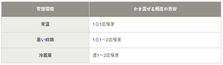
シンプルな比較表
項目ごとの違いをすっきり整理できる、 2列タイプの比較表です。
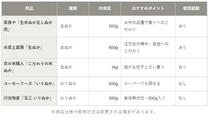
商品比較表
複数の商品の特徴や使用経験を 一覧で比較できる表です。
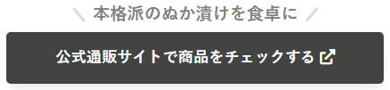
アフィリエイトボタン
案内文とボタンを組み合わせた、 商品紹介用のリンクです。
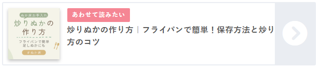
カード型の関連記事リンク
サムネイルと記事タイトルをまとめた、 見やすい関連記事カードです。
① シンプルな比較表(2列)
左列に項目名、右列に説明を配置したシンプルな2列の表です。 列幅と背景色を調整し、スマートフォンでは横スクロールできるようにしています。
設定場所:
SANGOのテーブルブロックを使用し、追加CSSクラスに
blut-table-2col を入力。
CSSは記事・ページのカスタムCSS欄などに設定。
CSSを見る
/* 2列の比較表 */

.wp-block-table.blut-table-2col {
  width: 100%;
  max-width: 100%;
  overflow-x: auto;
  -webkit-overflow-scrolling: touch;
}

.wp-block-table.blut-table-2col table {
  width: 100%;
  min-width: 650px;
  table-layout: fixed;
  border-collapse: collapse;
  font-size: 14px;
  line-height: 1.7;
  color: #カラーコード;
}

.wp-block-table.blut-table-2col table th,
.wp-block-table.blut-table-2col table td {
  box-sizing: border-box;
  padding: 12px 10px;
  border: 1px solid #カラーコード;
  vertical-align: middle;
  white-space: normal !important;
  overflow-wrap: anywhere;
  word-break: normal;
}

.wp-block-table.blut-table-2col thead th {
  background-color: #カラーコード !important;
  color: #カラーコード !important;
  font-weight: 700;
  text-align: center;
}

.wp-block-table.blut-table-2col tbody tr > :first-child {
  background-color: #カラーコード !important;
  color: #カラーコード !important;
  font-weight: 700;
  text-align: center;
}

.wp-block-table.blut-table-2col tbody tr > :nth-child(2) {
  background-color: transparent !important;
  color: #カラーコード;
  font-weight: 400;
  text-align: left;
}

.wp-block-table.blut-table-2col table tr > :first-child {
  width: 40%;
}

.wp-block-table.blut-table-2col table tr > :nth-child(2) {
  width: 60%;
}

@media (max-width: 767px) {
  .wp-block-table.blut-table-2col table {
    font-size: 13px;
  }

  .wp-block-table.blut-table-2col table th,
  .wp-block-table.blut-table-2col table td {
    padding: 10px 8px;
  }
}
② 商品比較表(5列)
商品情報を5列で比較する表です。 左端を項目ラベルとして目立たせ、2・3列目の数値は右揃えにしています。
設定場所:
SANGOのテーブルブロックを使用し、追加CSSクラスに
blut-table-5col を入力。
CSSは記事・ページのカスタムCSS欄などに設定。
CSSを見る
/* 商品比較表(5列) */

.wp-block-table.blut-table-5col {
  display: block;
  width: 100%;
  max-width: 100%;
  overflow-x: auto;
  -webkit-overflow-scrolling: touch;
}

.wp-block-table.blut-table-5col table {
  width: 100%;
  min-width: 650px;
  table-layout: auto;
  border-collapse: collapse;
  font-size: 14px;
  line-height: 1.7;
  color: #カラーコード;
}

.wp-block-table.blut-table-5col table th,
.wp-block-table.blut-table-5col table td {
  box-sizing: border-box;
  min-width: 110px;
  padding: 12px 10px;
  border: 1px solid #カラーコード;
  vertical-align: middle;
  white-space: normal !important;
  overflow-wrap: anywhere;
  word-break: normal;
}

.wp-block-table.blut-table-5col thead th {
  background-color: #カラーコード !important;
  color: #カラーコード !important;
  font-weight: 700;
  text-align: center !important;
}

.wp-block-table.blut-table-5col table tr > :first-child {
  min-width: 130px;
}

.wp-block-table.blut-table-5col tbody tr > :first-child {
  background-color: #カラーコード !important;
  color: #カラーコード !important;
  font-weight: 700;
  text-align: left !important;
}

.wp-block-table.blut-table-5col tbody tr > :not(:first-child) {
  background-color: transparent !important;
  color: #カラーコード;
  font-weight: 400;
  text-align: left;
}

/* 2列目・3列目は右揃え */
.wp-block-table.blut-table-5col tbody tr > :nth-child(2),
.wp-block-table.blut-table-5col tbody tr > :nth-child(3) {
  text-align: right !important;
}

@media (max-width: 767px) {
  .wp-block-table.blut-table-5col table {
    font-size: 13px;
  }

  .wp-block-table.blut-table-5col table th,
  .wp-block-table.blut-table-5col table td {
    padding: 10px 8px;
  }
}
文字揃えの変更:
text-align: right を
left(左寄せ)や
center(中央寄せ)に変更できます。
:nth-child(2) の数字を変えると対象の列も変更できます。
③ アフィリエイトボタン
SANGOのボタンブロックで幅や余白を調整したボタンです。 上部には、見出しブロックを利用したマイクロコピーを組み合わせています。
設定場所: ボタンはSANGOのボタンブロック、 マイクロコピーは見出しブロックを使用。 それぞれ追加CSSクラスを設定。
ボタンのCSSを見る
/* ボタン本体:追加CSSクラス blut-affiliate-button */
.btn.blut-affiliate-button {
  border: 2px solid transparent;
  position: relative;
  width: 100%;
  max-width: 420px;
  border-radius: 5px;
  padding: 0.65em 1.3em;
  box-sizing: border-box;
  margin: 0 auto;
}

.btn.blut-affiliate-button img {
  position: absolute;
}

.btn.blut-affiliate-button p {
  margin: 0;
}
マイクロコピーのCSSを見る
/* マイクロコピー:追加CSSクラス blut-affiliate-copy */
.sgb-heading.blut-affiliate-copy {
  display: inline-block;
  position: relative;
  padding: 0 25px !important;
  color: #カラーコード;
  line-height: 1;
  letter-spacing: calc(var(--sgb--custom--letter-spacing, 0) * 1px);
}

.sgb-heading.blut-affiliate-copy .sgb-heading__text {
  position: relative;
  padding: 0 25px;
}

.sgb-heading.blut-affiliate-copy .sgb-heading__text::before,
.sgb-heading.blut-affiliate-copy .sgb-heading__text::after {
  display: inline-block;
  position: absolute;
  top: 50%;
  width: 20px;
  height: 3px;
  border-radius: 3px;
  background-color: var(--sgb--custom--bg-color, #カラーコード);
  content: "";
}

.sgb-heading.blut-affiliate-copy .sgb-heading__text::before {
  left: 0;
  transform: rotate(50deg);
}

.sgb-heading.blut-affiliate-copy .sgb-heading__text::after {
  right: 0;
  transform: rotate(-50deg);
}④ カード型の関連記事リンク
SANGOの関連記事リンクをカード型に装飾するカスタマイズです。 関連記事への導線を分かりやすく見せています。
設定場所: SANGOの関連記事リンクを使用し、 参考記事の手順に沿ってCSSを設定。
参考・カスタマイズ方法: for men|関連記事リンクのカスタマイズ
細かな表示調整
① 本文文字色の調整
記事本文の文字色を調整し、サイト全体の雰囲気に合わせながら読みやすさを整えています。
設定場所: 外観 → カスタマイズ → 追加CSS
CSSを見る
/* 本文の文字色の変更 */
body {
  color: #カラーコード;
}② 記事上部の余白調整
画面幅に合わせてコンテンツ上部の余白を調整し、スマートフォンとPCで自然な間隔になるよう表示を整えています。
設定場所: 外観 → カスタマイズ → 追加CSS
CSSを見る
/* 記事上部の余白を狭く */
#content {
  margin-top: 0 !important;
}

/* 768px以上の画面 */
@media only screen and (min-width: 768px) {
  #content {
    margin-top: 1em !important;
  }
}③ フッター下の余白対策
コンテンツが少ないページでも、 画面の高さに合わせてコンテンツ領域の最低高さを確保し、フッターが画面の途中に表示されにくいようにしています。
設定場所: 外観 → カスタマイズ → 追加CSS
CSSを見る
/* コンテンツが少ないときの余白対策 */
#content {
  min-height: calc(100vh - 200px);
}
※ 200px は、サイトのヘッダーや
フッターの高さなどに合わせて調整してください。